
 Stay
Stay 


 10:51 2026-01-21
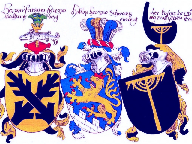
 750
750 6
6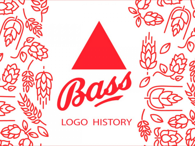
Heraldry — first corporate identities
Medieval coats of arms were the first logos in history. They followed strict rules in which each color, plant, or animal carried a unique meaning. The lion, for example, signified courage, while gold denoted wealth. The heraldic device served as a visual passport meant to be recognized in the heat of battle from hundreds of meters away. Heraldic principles still live on in the logos of premium auto brands (Porsche, Ferrari) and in national emblems, reminding us of the aristocratic roots of modern identity.
Bass Ale — pioneer of industrial branding
In 1876, the red triangle of Bass brewery became the first officially registered trademark in Britain. Its appearance was a turning point. From that moment, a symbol no longer belonged only to kings; it belonged to a product. The design was deliberately simple so it could be recognized even by illiterate workers in port taverns. Thus began the era of industrial branding in which a geometric shape became a guarantee of authenticity.
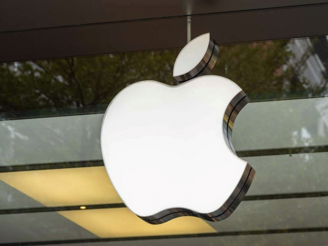
Golden ratio and mathematics of Apple
The Apple logo is a triumph of geometry. Despite its apparent simplicity, it is constructed on strict mathematical principles and proportions of the golden ratio. The bitten apple is not only a metaphor for knowledge, tracing back to the biblical tale. It is also a form calibrated for ideal perception by the human eye. That mathematical “rightness” subconsciously evokes order, reliability, and technological perfection in consumers — a key ingredient of the brand’s magic.
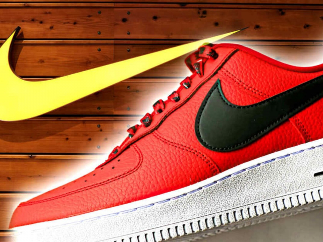
Nike Swoosh — motion for $35
The Nike swoosh is one of the cheapest ideas to produce (designer Carolyn Davidson was paid just $35 for it in 1971) and one of the most valuable today. It is pure emotion, conveying the sound of air being sliced and the sensation of speed. It does not depict shoes; it depicts victory. Nike proved that a logo does not need to be complex — it only needs to be dynamic. Today, the swoosh is a symbol of an athletic lifestyle that has transcended sport and become part of high fashion.
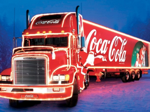
Coca‑Cola — magic of consistency
While rivals (Pepsi) have changed their marks dozens of times, Coca‑Cola has preserved its calligraphic script since the 1880s. This is a strategy of the “visual anchor.” In a world that changes too quickly, a constant logo evokes nostalgia and trust. Spencerian script has become synonymous with celebration and family values. It is an example of how design can become part of humanity’s cultural code while remaining timelessly modern.
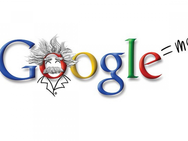
Dynamic logos — code instead of picture
The future, now here in 2026, belongs to generative logos. Companies no longer have a single static image. Google’s Doodles or branding for cultural institutions can change color and shape depending on the weather, the news, or the user’s mood. This is a “breathing” identity. A logo stops being a seal on paper and becomes software — code that interacts with reality, underscoring a brand’s adaptability and intelligence.


